Hi Sabina! We’re thrilled to welcome you aboard as a Motiva artist. Tell our readers a bit about who you are.
First of all thank you for inviting me to join this wonderful collection of artists! I am honored.
My fascination with the shapes of letters started during my first year as a student at UNArte Bucharest, in the Graphic Design section. I continued my learning journey in the field of type design in Barcelona, where I pursued a Master’s in Advanced Typography at EINA and collaborated with various local studios. Following that, I undertook an internship at Monotype in London and attended the Reading Summer School Type Design Program.
Eventually, I settled in Amsterdam, where I began my adventure as an independent designer. Every day I explore the relationship between letters, brand image, and the stories of letters, offering a written voice of the world around us. My specialization lies in creative lettering, type design, and typographic production.
Do you view typography as a form of art, or do you perceive it differently?
Designing letters, from my point of view, is a craft. It sits at the intersection of design and art. Letters must carry a message while simultaneously serving as the visual representation and intonation of that message. There are minuscule details that type designers must tackle in order to effectively design a typeface.
Additionally, there is the technical aspect of the craft, involving knowledge of the technology required to produce typefaces that function properly in various environments, whether printed or digital. Especially now, with the abundance of different digital devices, all of which require letters to communicate.
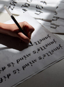 Sabina Kipara creating her unique Motiva font
Why did you decide to do this collaboration with Motiva?
I attended an art high school, where drawing, painting, and working with clay were part of my weekly schedule. I love projects that give me the opportunity to explore the more artistic aspects of type design, such as calligraphy, brush painting, and lettering. The technology that Motiva uses for their artworks intrigued me; creating a typeface with it in mind intrigued me even more. The idea of using written quotes was also very interesting from a type designer’s point of view. Additionally, I must admit that I am a big fan of other artists already featured in the Motiva collection.
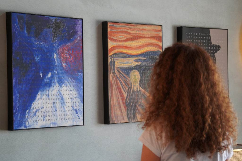
What can you tell us about your Motiva entitled “Janelle’s Mind is Different” ? What is the story behind it?
Motiva gave me the perfect opportunity to highlight a project dear to me: EMiD (Every Mind is Different), a multidisciplinary art project aimed at raising awareness for mental health through art therapy. Initiated by my brother, Bogdan Chipară, in 2021, EMiD seeks to address the pressing need for better support and understanding of mental health issues. As a type and graphic designer I believe that art and design should ask questions and try to find solutions to different problems.
With approximately 1 in 5 individuals experiencing mental distress, it is evident that we must find more effective ways to support one another. EMiD poses a fundamental question: can art facilitate the expression of our emotions and provide solace in our struggles?
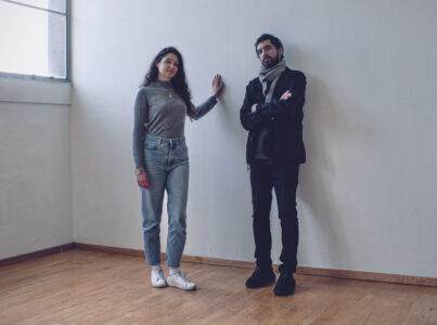 Sabina Kipara and her brother Bogdan
The concept behind “Janelle’s Mind is Different” was to merge a digital drawing titled ‘Janelle’ with a brush typeface, creating the illusion that the character is writing directly on the artwork. ‘Janelle’ symbolizes a woman gazing directly at the viewers, inviting them to delve into her world and thoughts through quotes related to art therapy.
The phrase ‘Janelle’s Mind is Different’ draws attention to the uniqueness of individual experiences while also highlighting the common thread that binds us all. Despite the differences in our minds, we share a collective humanity that fosters connection and empathy.
Is Janelle a real person? Someone you know?
Janelle is a fictional character created to symbolize the human experience of facing life’s challenges. She confronts the unknown with determination to overcome distress. Her ‘thoughts’ about art are expressed through the quotes featured.
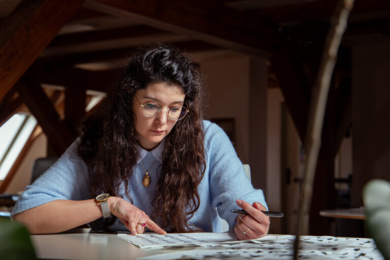
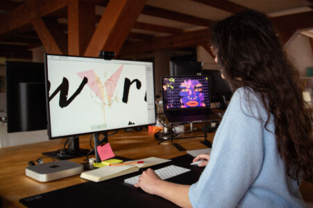 Sabina Kipara creating “Janelle’s Mind Is Different” in her studio
How were the quotes featured in this Motiva chosen?
The quotes featured in this Motiva project were chosen to align with the themes and objectives of the EMID initiative, which my brother developed. They reflect the essence of EMID, which aims to communicate emotions through art and provide comfort through creativity. We believe that everyone is creative, whether expressed through painting, baking, sewing, writing, and so on.
Can you describe the process behind creating this illustration?
For my collaboration with Motiva, I envisioned an approach beyond typography for this artwork. I reached out to my brother, who had previously created digital drawings as part of his creative therapy sessions. Using 40x50cm clayboards, he crafted stencils of a portrait in three layers, along with a background. These stencils were drawn as vector lines, then cut out using a CNC laser and utilized for spray painting on the board.
Experimenting with different layer orders and colors resulted in a small physical collection of artwork. These pieces were photographed and served as input for Midjourney, leading to combinations of the same style and ultimately producing Janelle! I also applied some Photoshop retouching to enhance contrast, sharpness, and define the brush strokes.
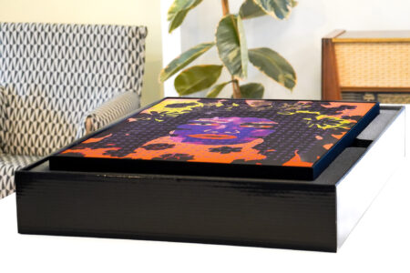
“Janelle’s Mind Is Different” by Sabina Kipara
So if I understand you created a whole new typeface for this project, how did you make this happen?
Yes, indeed! The typeface I developed for this project is called Motiva Brush. It exclusively contains lowercase letters, aligning with the grid concept utilized by Motiva for their quotes. To optimize its performance, I aimed for a monospaced design. I balanced the widths of letters like ‘m’ with narrower ones such as ‘i’ and ‘l’. However, I also wanted the quotes to convey a handwritten appearance. Therefore, I began by manually writing each letter with a brush pen, creating multiple versions of each character. After careful consideration, I selected the versions that harmonized best within words.
With the quotes, illustration and typeface all coming together, what do you think about the final outcome and the message it sends?
Together with my brother, we are extremely pleased with the outcome. We believe the artwork delivers a powerful message! It serves as a compelling invitation to contemplate the challenges of modern times and how we can support each other. It encourages dialogue and reflection.